Project
SaaS Game Engine - B2C/B2B
Timeline
2022 - 2024
Team
Senior Product Designer, Two Developers. One Producer
Industry
Gaming & Technology
Overview
I led the design of the new code editor which was part of a large overhaul of the workflow of GameMaker.
GameMaker's IDE was struggling. Users were frustrated with cluttered workspaces, rigid workflows, and limited customisation. The old workspace system wasn't working—people kept closing everything and starting fresh rather than using it as intended.
Limited Space
The IDE (integrated development environment) was too cluttered.
Bespoke Enforced Workflow
Workspaces, the default workflow, were not being used as intended. People were closing editors and starting from scratch.
Too Rigid
Not enough customisability and users were feeling restricted in their workflow.

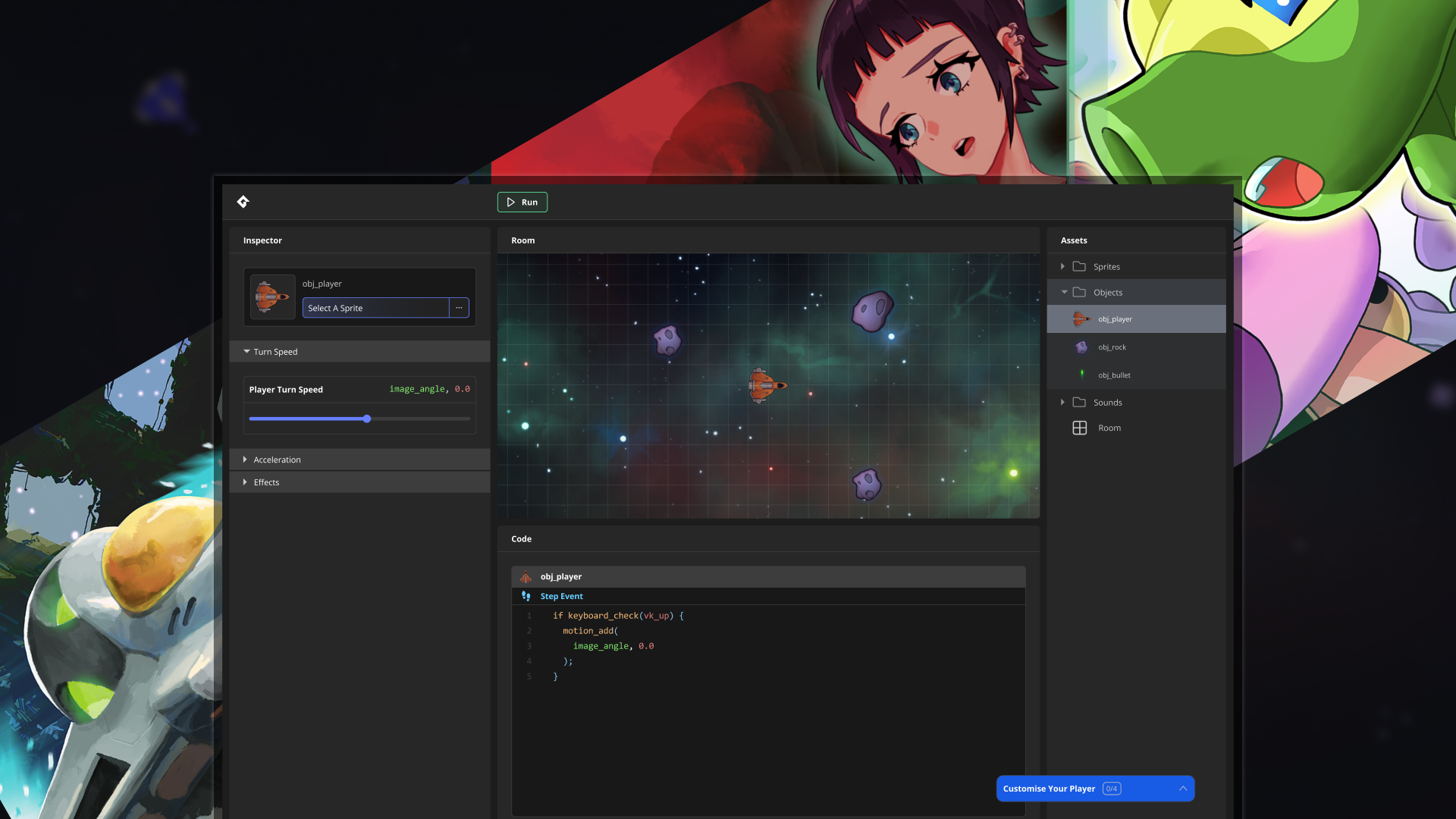
Full-screen Editors
I wanted to expand the UI so that users had the most space possible when developing and navigating the editors.
Redesign The Fundamental Workflow
Experimenting without workspaces and creating an inspector window flow we reduced the user's need to pan around or jump between places.
Improve Customisability
Giving the user ways to customise their workflow we made it feel like a personal tool that works best for any type of developer.

Massively improved developer workflow benefiting ease of use and time.
90%
Agreed solution improved workflow
10/10
Power users approved direction
The previous system used cascading node chain windows in an infinite panning workspace. Which looks cool but a nightmare to use. Observations showed users getting lost after opening just 1-2 editors, then rage-closing everything to start over.
I explored four directions:
1. Inspector window based
2. Full dialogue box windows
3. Four-way split screens
4. Expansion of existing node chain editors
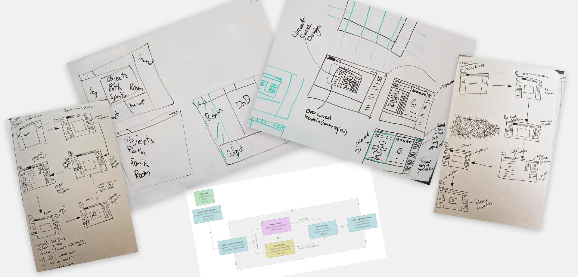

Felt "tacked on" and still involved workspaces. The 4 way split felt too unique with a learning curve.

Forces the user to handle floating windows resulting in overlapping editors and frustration while editing multiple assets

An industry standard that allows for spacious and clean workflow with excellent customisation potential
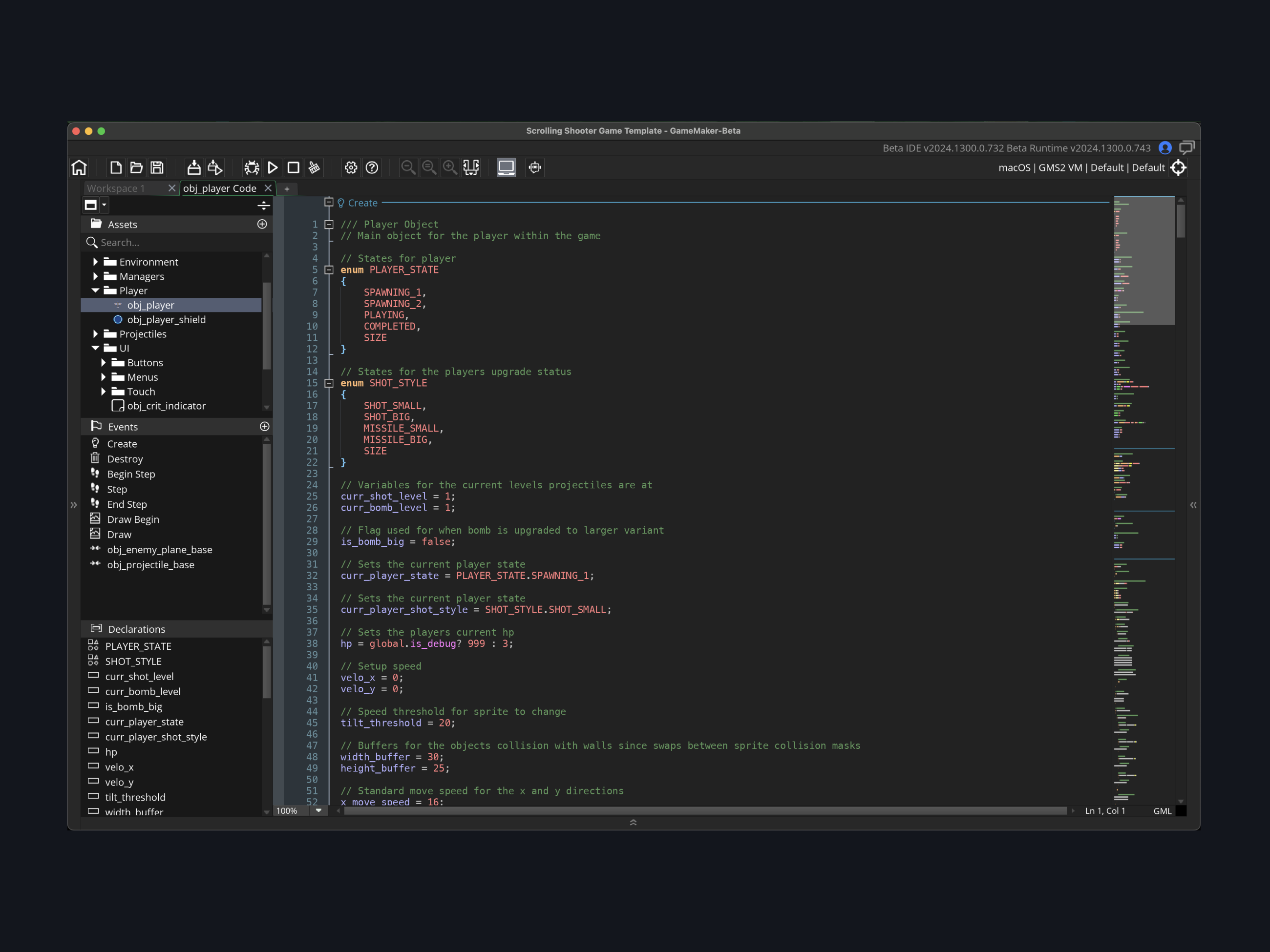
After weighing floating windows (spacious but messy) against tabbed editors (industry standard, customisable), we chose tabbed full-screen editors with an inspector window.
This gave us:
- Maximum screen space
- Consistent, learnable interface
- Less jumping between locations
- Room to scale for future features
This workflow reduced the need to learn 13 different bespoke editors and focused developer flow into one consistent space.


I iterated through three versions based on prototype testing:

Version One
Replicated vertical editors but every element was bespoke (development nightmare)

Version Two
Added vertical split for expandable properties but info kept getting hidden

Version Three
Built a design system with reusable components.
Clean, consistent, and only a few bespoke widgets for vital features.
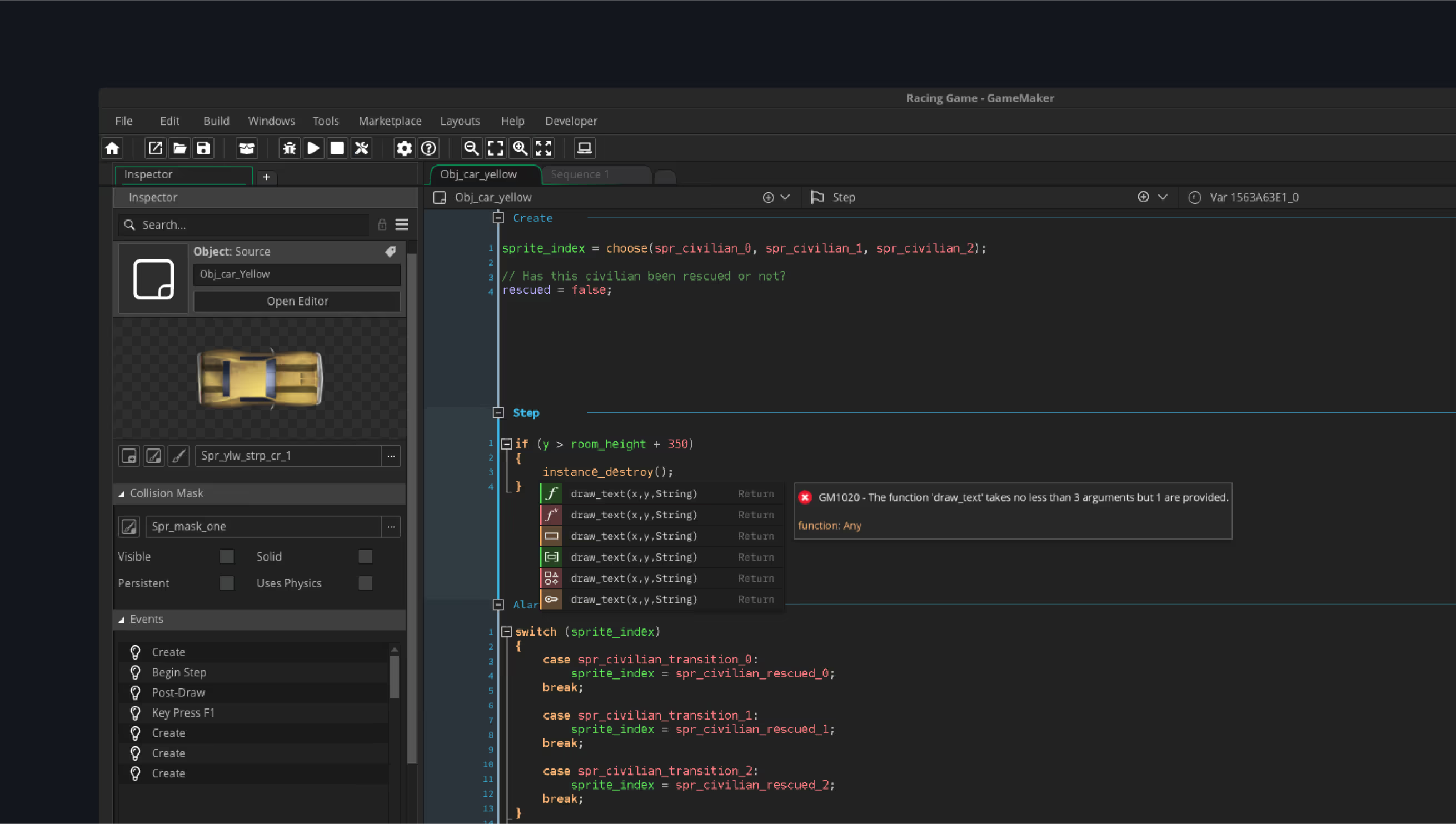
Full-screen editors meant we could consolidate four separate editors (code, notes, scripts, shaders) into one unified space. Improve one, improve them all.

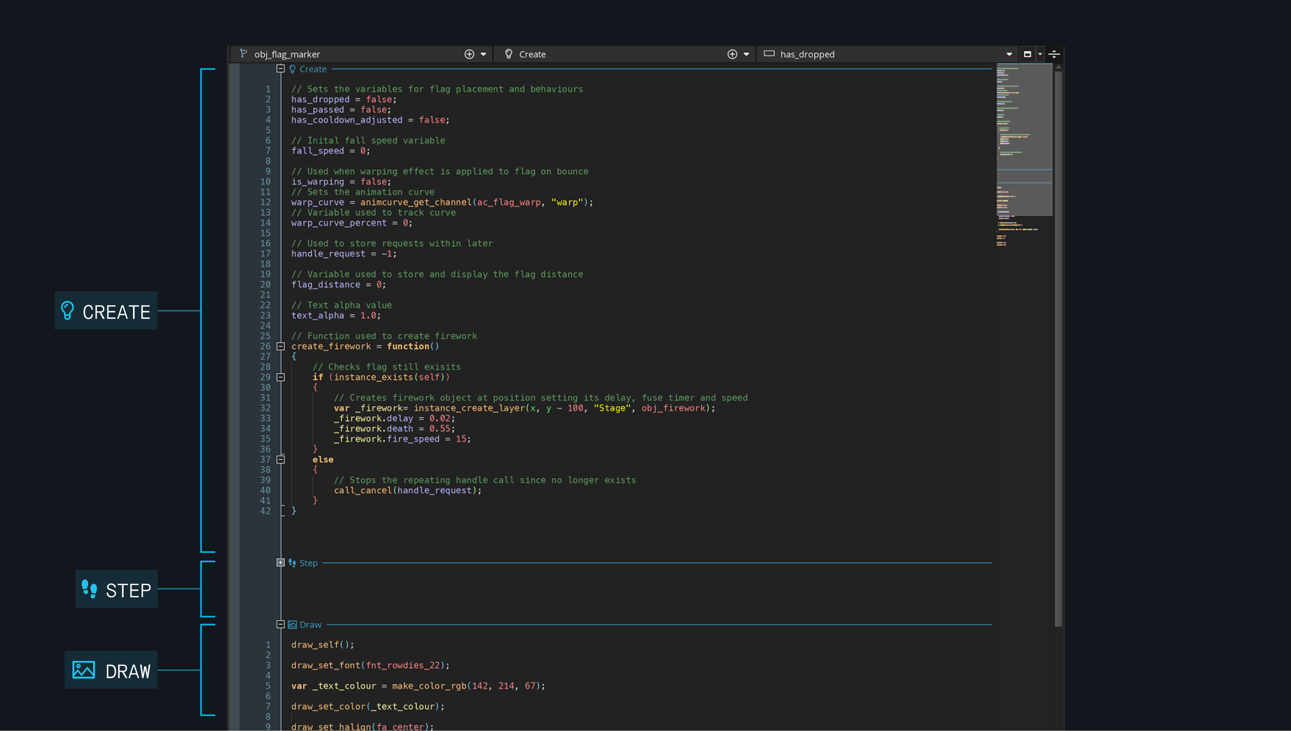
To improve on the code editor I designed an in-depth navigation system to allow for quick and powerful workflow.
Asset
Jump between any code files without opening the asset browser
Event
Navigate within files, reducing tab overload
Function
Advanced users can jump to specific code sections

Version One
Before testing, I built a drop-down navigation that mirrored the asset browser. It worked well, but technical and time constraints pushed us to pivot.

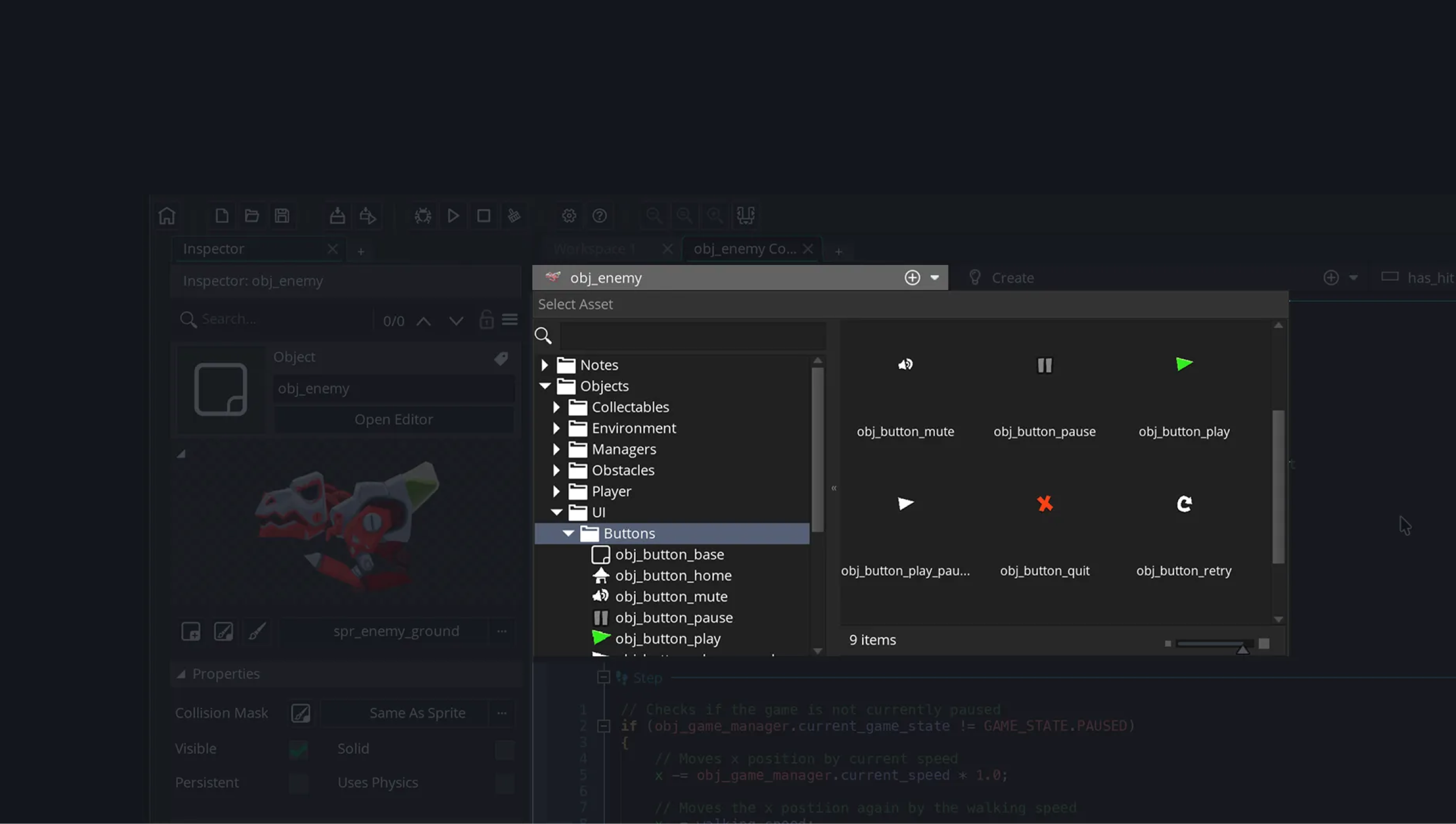
Version Two
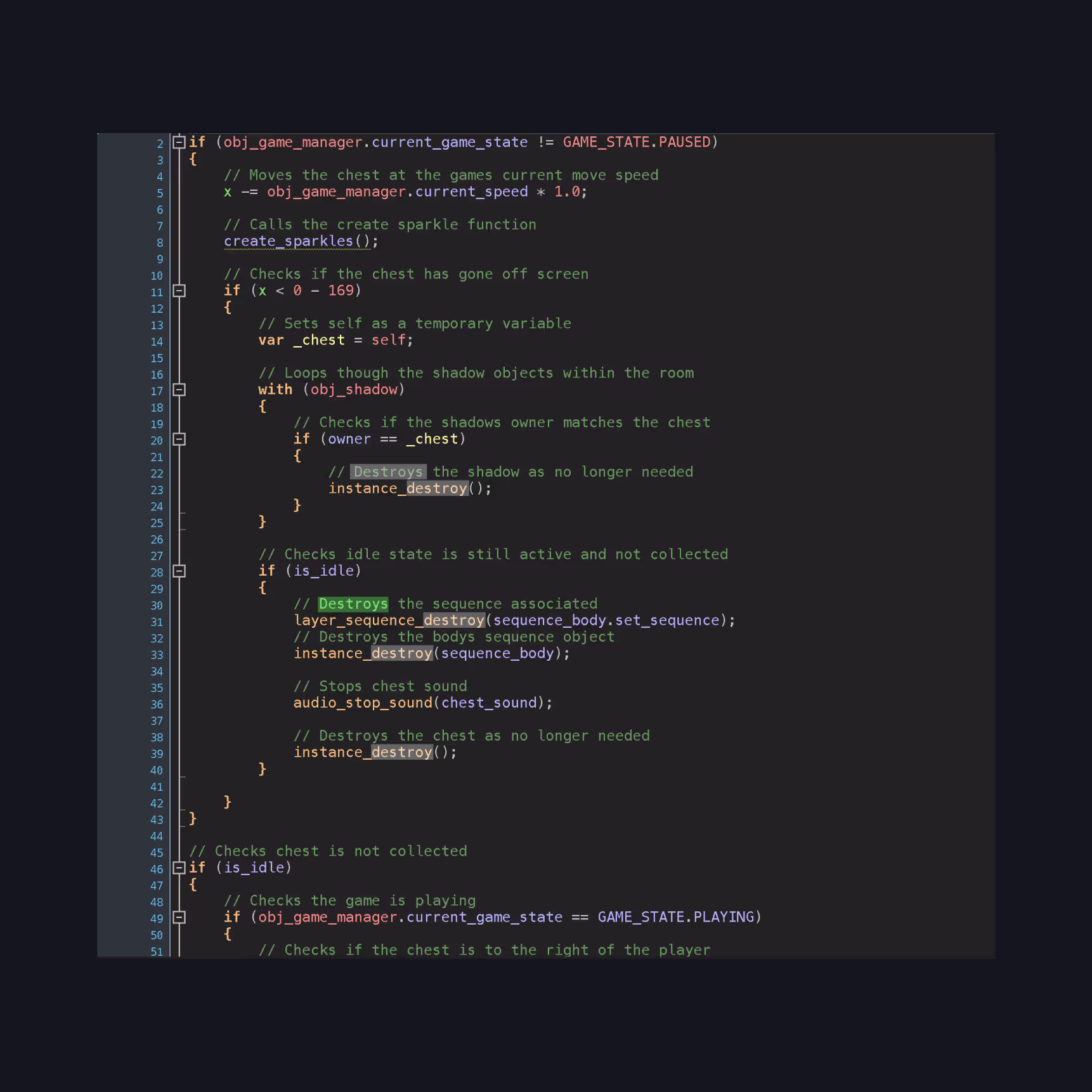
We chose to use the IDE’s existing asset finder, accelerating development and giving users a familiar interface with bigger, clearer thumbnails.
Combined all event files into one view for faster editing. Added a preference toggle for users who wanted the old separate-file approach.


- Smart tooltips for learning
- Code minimap for large files
- Light theme for accessibility
- Syntax highlighting improvements


We iterate in three stages:
Internal build – Where designers sweat
Beta release – Gathering real user feedback
Full release – When it's actually ready


Feedback comes from GameMaker forums, Discord (direct user access), GitHub (voting on requests), and social media monitoring.

Set the future direction. Users both internally and externally were onboard with the direction and it is the foundation of the next evolution of the IDE.
Big changes need careful handling. Redesigning core workflows for 180k monthly users is terrifying. Success came from rigorous testing, constant iteration, and listening to feedback.
An external web platform that lets users remix an arcade game, teaching fundamental game development IDE flows through play instead of instruction.